Bloom Off the Rose: Building a Scalable UX Practice

A self-initiated UX leadership project focused on clarity, structure, and accessibility for small and mid-size business digital ecosystems.

MY ROLEFounder & Lead UX
FOCUS AREAAccessibility & IA
KEY OUTPUTScalable Frameworks
STATUSActive Practice

Clarity Over Complexity

Small and mid-size business websites often suffer from unclear information architecture, inaccessible content, and inconsistent user flows. Owners typically rely on templates or ad-hoc design decisions, resulting in experiences that are difficult to navigate and misaligned with user needs.

Bloom Off the Rose began as a UX leadership initiative to explore how structured UX processes could be applied to these digital ecosystems without assuming a large enterprise budget.

My Role & Responsibilities

This was a self-directed leadership project focused on building frameworks for future engagements. I led all UX efforts, including:

  • UX Strategy & Operations
  • Information Architecture (IA)
  • Accessibility Auditing
  • Content Hierarchy & Modeling

Understanding the Audience

To build a practice that truly serves small and mid-size businesses, I first needed to deeply understand their distinct needs, constraints, and digital behaviors. I developed four core personas based off of interviews that I conducted to guide every design decision.

Portrait of Maria Santos

Maria Santos, 38

Owner, Boutique Bakery • Austin, TX

"I know my website isn't great, but I don't know where to start fixing it."

Bio

Maria opened her bakery 6 years ago. She built her first website on Squarespace but knows it needs professional help. She's resourceful and wants to understand the 'why' behind design decisions.


Brands & Tools

SquarespaceInstagramSquare POSCanva
Tech Comfort:Medium
iPhone, Laptop

Goals

  • Improve online ordering UX to reduce abandoned carts
  • Make her site accessible to all customers
  • Get actionable improvements within her limited budget

Pain Points

  • Overwhelmed by technical jargon from past agencies
  • Previous redesign looked nice but didn't increase sales
  • Can't afford a massive retainer or long engagement

Motivations

  • Wants to compete with bigger bakeries online
  • Believes every customer deserves a smooth ordering experience
  • Wants to learn enough UX to maintain her site confidently
Portrait of Sarah Okafor

Sarah Okafor, 41

VP of Digital, Healthcare SaaS • Chicago, IL

"We need a UX partner who understands compliance, not just aesthetics."

Bio

Sarah joined her healthcare SaaS company 3 years ago to build out their UX function. She manages a team of 6 but needs external support for specialized accessibility work and scaling the design system.


Brands & Tools

FigmaJiraConfluenceHotjarMaze
Tech Comfort:High
💻MacBook Pro, iPad, Android

Goals

  • Redesign patient portal for better usability and HIPAA compliance
  • Build a scalable design system for her growing product team
  • Establish ongoing UX research practice

Pain Points

  • Internal team is too small to handle UX research at scale
  • Board is pushing for ADA compliance before next fiscal year
  • Previous agency delivered beautiful designs that failed usability testing

Motivations

  • Wants to prove UX ROI to her board with measurable outcomes
  • Needs a partner who can upskill her internal team, not replace them
  • Looking for a long-term relationship, not a one-off project
Portrait of David Chen

David Chen, 45

Founder, Accounting Firm • Portland, OR

"If my own website isn't accessible, how can I tell clients I value inclusion?"

Bio

David has been legally blind since age 30 due to macular degeneration. He founded his firm to serve clients who value inclusion. He evaluates every vendor through an accessibility lens.


Brands & Tools

ZoomTextJAWS (backup)QuickBooksMicrosoft 365
Tech Comfort:High
🖥️Desktop + zoom, iPhone
Assistive Tech Profile

Low vision - uses screen magnification (ZoomText), large text, and high contrast settings daily.

Goals

  • Ensure his firm's website meets WCAG 2.2 AA standards
  • Lead by example on accessibility in his industry
  • Improve client portal experience for all users

Pain Points

  • His current site fails basic screen reader tests
  • Previous developer said accessibility was 'too expensive' to retrofit
  • Struggles to evaluate design mockups visually during review

Motivations

  • Wants his website to be a model of accessible design
  • Needs to prove to prospective clients that he practices what he preaches
  • Wants to mentor other small businesses on accessibility
Portrait of James Whitfield

James Whitfield, 52

COO, Mid-Size E-Commerce • Denver, CO

"Every click we eliminate from checkout is revenue we recover - and for me personally, it's fewer painful movements."

Bio

James developed RSI in his 40s. He transitioned to voice commands and keyboard-only navigation. His personal experience with inaccessible interfaces fuels his passion for inclusive e-commerce.


Brands & Tools

Dragon NaturallySpeakingShopify PlusGoogle AnalyticsFigma
Tech Comfort:High
🖥️Desktop (Dragon/KB), iPad
Assistive Tech Profile

Motor disability (RSI) - uses voice commands (Dragon), strict keyboard-only navigation without mouse, and tablet assistive touch.

Goals

  • Reduce checkout friction to improve conversion rates
  • Ensure the entire shopping experience works with keyboard-only navigation
  • Build an inclusive design culture within his product team

Pain Points

  • Analytics show 68% cart abandonment but team can't pinpoint causes
  • Many interactive elements require precise mouse clicks
  • Company has been sued twice over web accessibility

Motivations

  • Wants to turn accessibility lawsuits into a competitive advantage
  • Personally invested - uses his own products daily and feels every UX friction point
  • Wants to build a company culture where accessibility is everyone's responsibility

Structuring for Clarity

With the user needs defined, I moved to structuring the information. Small business sites often fail due to cognitive overload. I designed a shallow, task-based architecture that prioritizes findability over feature density.
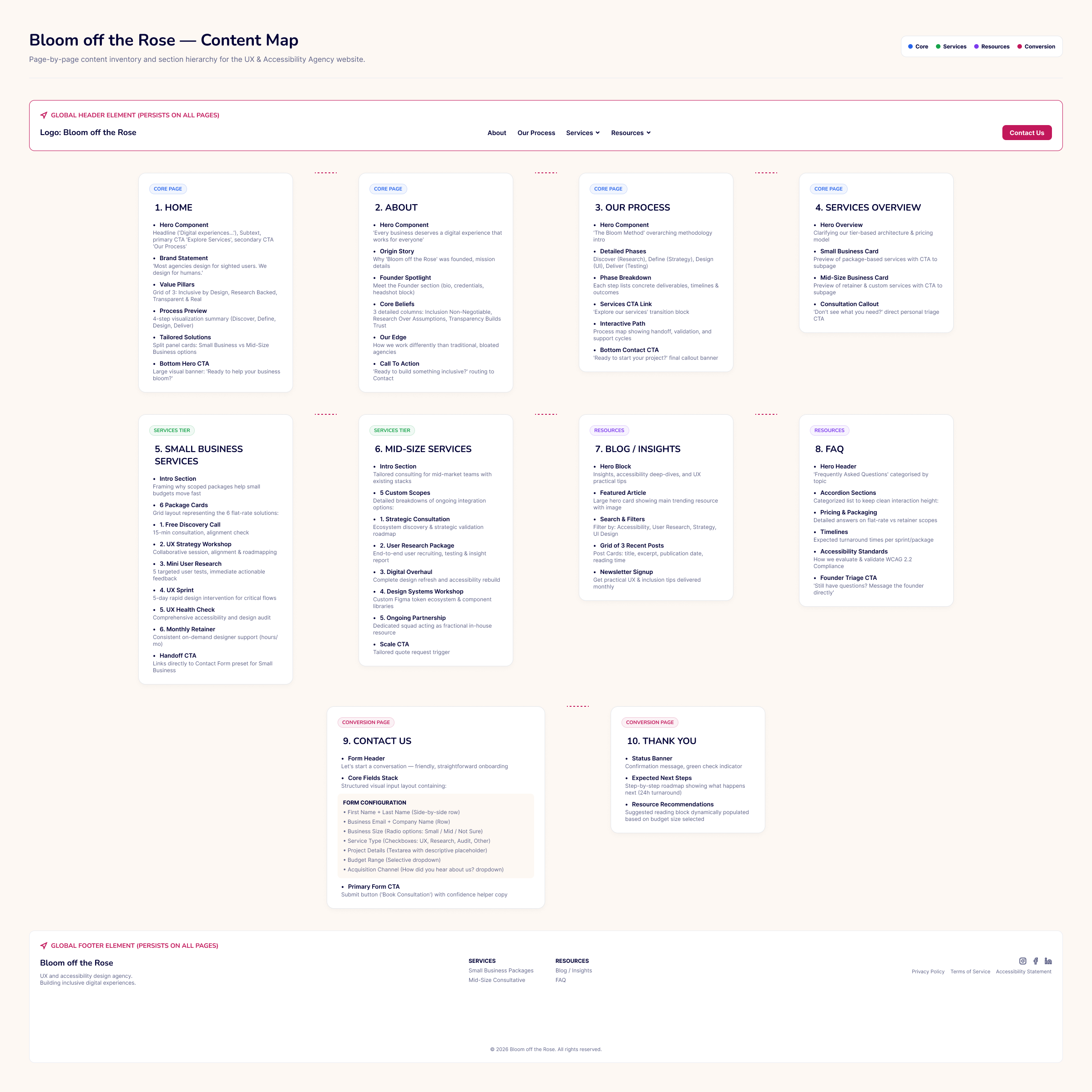
Screenshot of the Content Map showing information architecture

Content Map

A visual representation of the site's information architecture, ensuring logical grouping and clear paths for users.
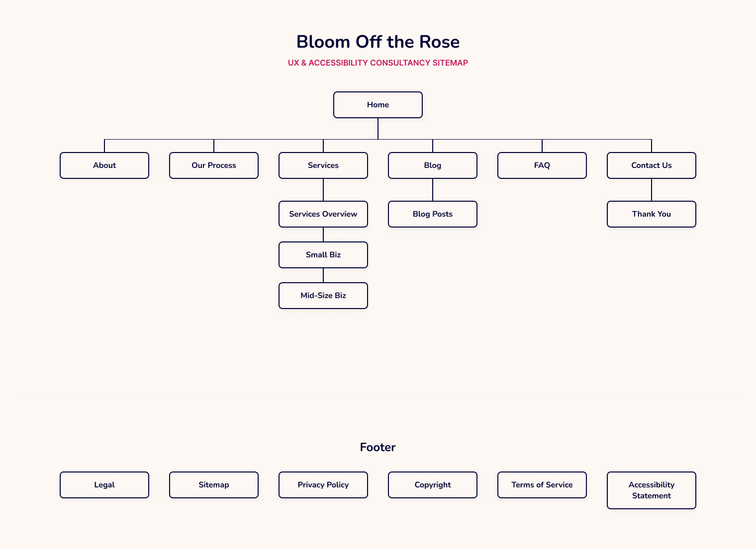
Screenshot of the hierarchical Sitemap showing page relationships

Sitemap

A hierarchical blueprint of all pages and their relationships, designed to minimize clicks and maximize discoverability.

Crafting the Visual Experience

Visual System & Color Palette

Just as roses naturally bloom in a rich variety of colors, each with its own distinct beauty and purpose, I developed a visual system that supports clarity, accessibility, and emotional tone. The palette was chosen to communicate grounded support, calm decision-making, and a sense of steadiness.

The palette balances:

  • Accessible contrast for readability
  • Emotional resonance to reinforce clarity and trust
  • Consistency across components for scalable UX patterns
Crimson
#C2185B
Cream
#fdf8f3
Soft Peach
#F9A064
Purple
#9D84B7
Forest Green
#2F7F4F
Airy Lavender-Grey
#EBECF2
Dark Navy
#000035
Pink
#F7CAC9

Defining How Users Move

With the visual system established, I defined the interaction patterns and structural rules that guide how users move through the experience. These foundations ensure consistency across flows and wireframes.
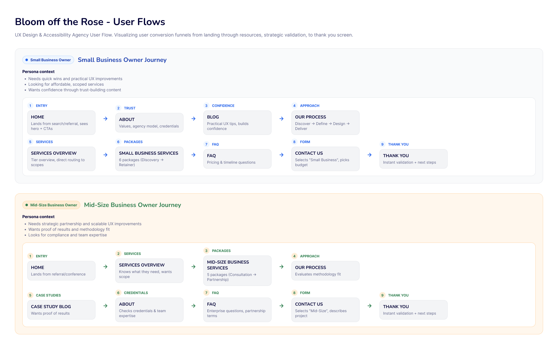
Screenshot of the User Flow showing step-by-step task paths

User Flow

Step-by-step task paths demonstrating how users navigate from entry to conversion, highlighting key decision points and accessibility checkpoints at each stage.
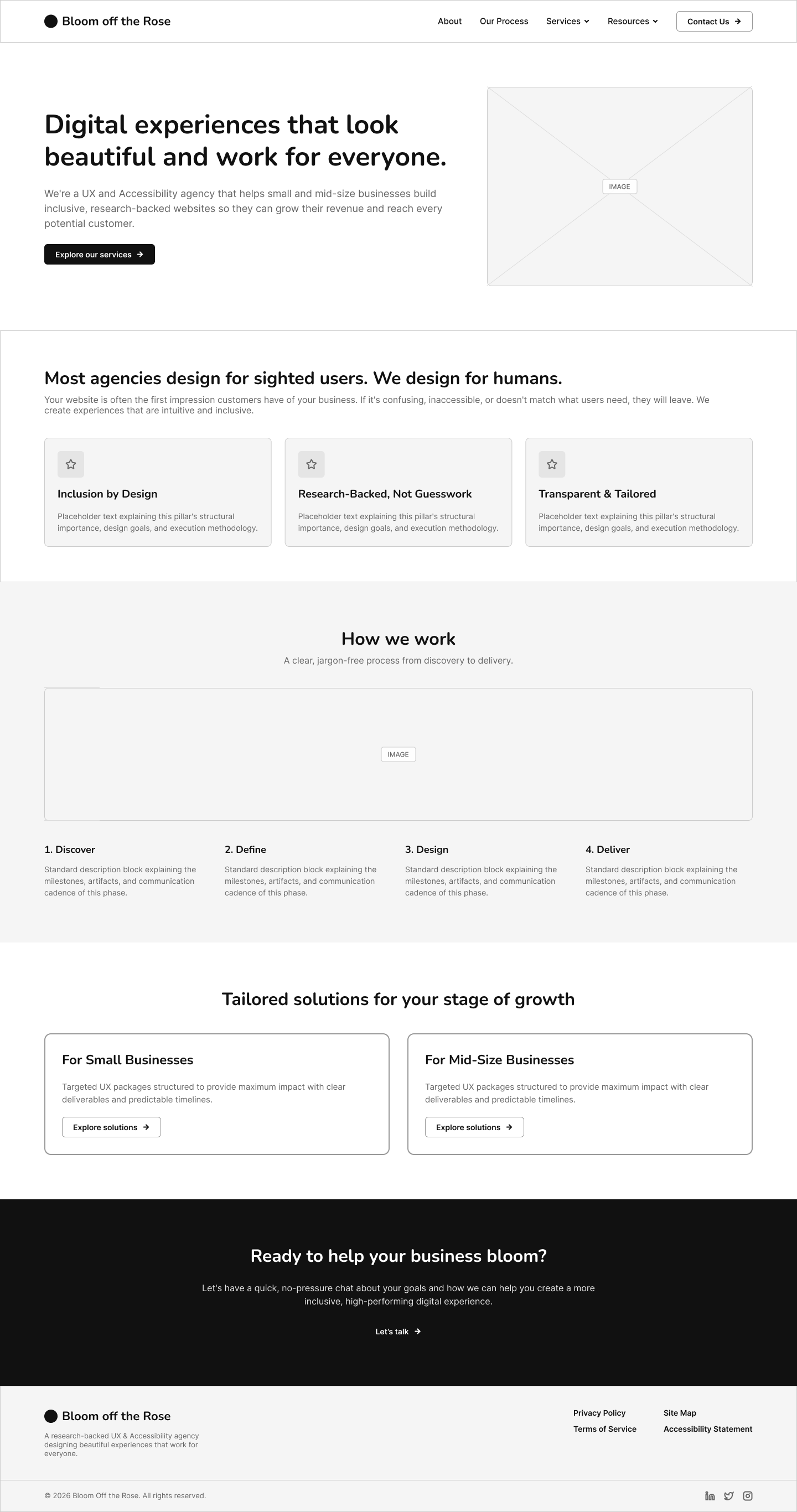
Desktop wireframe of the Homepage layout

Homepage

Establishes clear value propositions, accessible navigation, and immediate calls to action for small business customers.
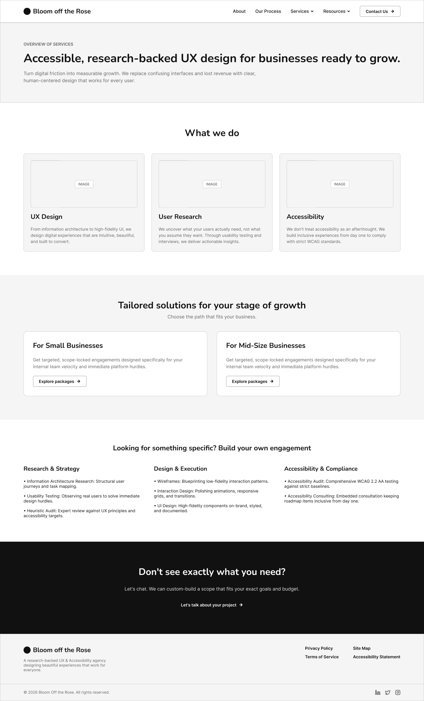
Desktop wireframe of the Services page layout

Services Overview

Uses modular content blocks and clear hierarchy to help users quickly scan offerings and understand pricing tiers.
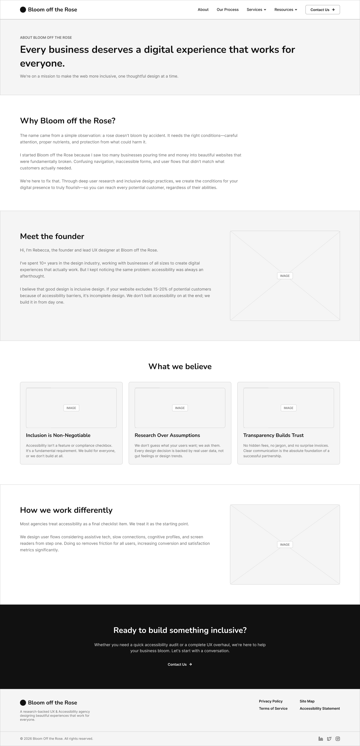
Desktop wireframe of the About page layout

About

Builds trust through transparent workflow visualizations, team introductions, and accessible content structures.
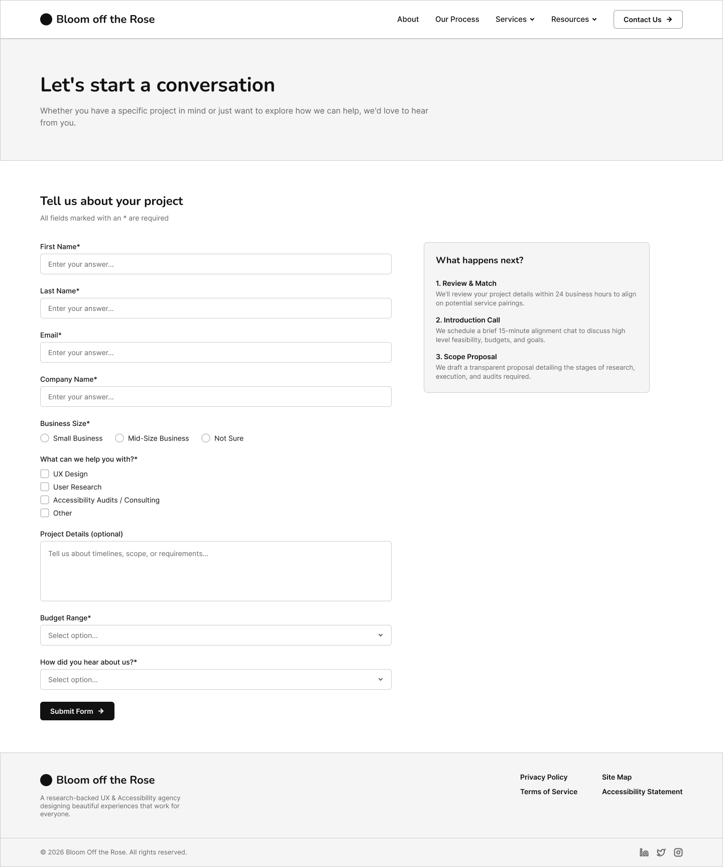
Desktop wireframe of the Contact page layout

Contact Us

A clear, accessible intake wireframe designed to collect key project information from small and mid‑size businesses.

Outcome & Reflection

Bloom Off the Rose resulted in a complete, clarity-driven UX practice ready for future engagements. This work strengthened my UX leadership practice by deepening my ability to create structure from ambiguity, build scalable systems, and integrate accessibility into every layer of UX.

A systems‑driven UX practice designed to bring clarity and accessibility to small and mid‑size businesses. It sharpened my leadership skills, expanded my operational toolkit, and reinforced my ability to design systems that scale for small and mid-size businesses.

Explore the Practice

Bloom Off the Rose continues to serve as a foundation for future small and mid-size business UX engagements and a demonstration of my leadership approach.

Visit Bloom Off the Rose (opens in new tab)