Healthcare UX: Insights from Cancer Patients Usability Testing
Evaluating workflow friction, task success rates, and accessibility barriers to validate information architecture improvements for vulnerable patient populations.
Validating the Core Cognitive Friction Points
The client needed to evaluate whether their new website structure effectively served two distinct patient populations: CML patients with 2+ prior treatments and Ph+ALL patients/caregivers. I conducted task-based usability testing to identify friction points and validate the information architecture.
Participants were encouraged to think aloud and share honest opinions as they completed each task, providing deep qualitative insights alongside quantitative success rates.
Core Hypothesis
"By restructuring the navigation to separate condition-specific content and implementing accessibility improvements, we will decrease user frustration and improve task completion rates."
Primary Research Questions
- Can patients successfully navigate to their condition-specific content?
- Where do users encounter accessibility barriers?
- How does mobile experience differ from desktop for this population?
Targeted Methodology & Demographics
Recruitment Criteria
16 participants through specialized agencies: 15 CML patients and 1 Ph+ALL caregiver, all 40+ years old (average age 60). Recruited participants with 2+ prior treatments.
Testing Protocols
60-minute moderated think-aloud sessions across desktop and mobile. Tasks: navigate to condition, access dosing page, download doctor discussion guide. Post-test questions gathered additional insights.
Ethical Considerations
Designed compassionate protocol with flexible session lengths, frequent breaks, and option to pause/stop. Sensitive to emotional and physical constraints of cancer patients.
Diagnostic Success Rates & Friction Analysis
Task Performance (Success vs. Fail)
Critical: Mobile Navigation Blockers
Mobile users encountered severe difficulties locating the sign-up option within the hamburger menu, requiring complete redesign and repositioning from center-aligned to left-aligned.
Medium: Accessibility Barriers
Participants reported insufficient color contrast, small text sizes on website and PDFs, and keyboard navigation issues preventing access for users with treatment-related disabilities.
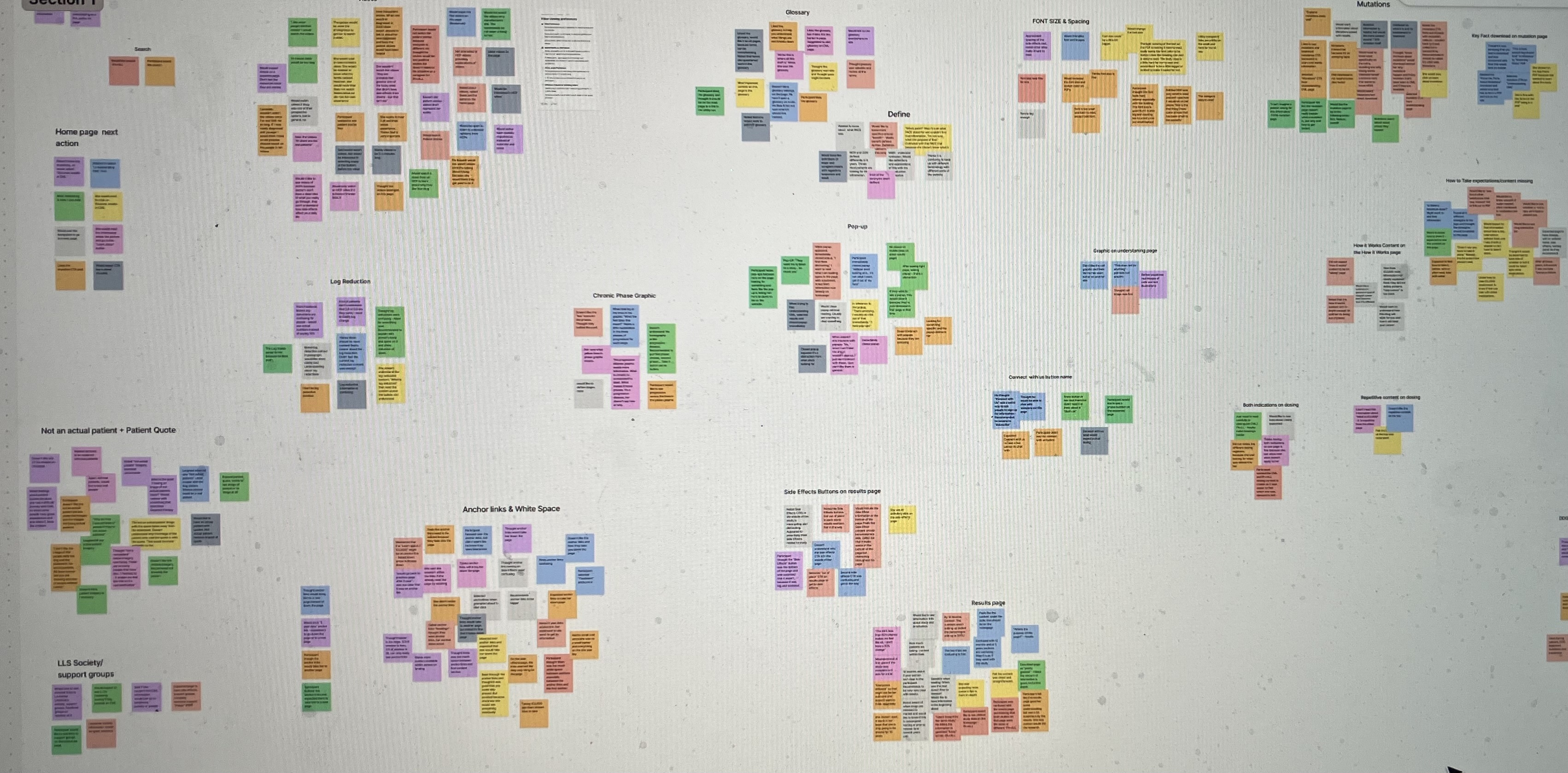
Grouping Friction Into Systemic Themes
Theme A: Navigation & Information Architecture
Patients struggled to find treatment information due to complex medical terminology and poor information hierarchy. Critical resources were buried under multiple navigation layers.
— Participant #7 (CML Patient)
Theme B: Accessibility & Mobile Experience
Severe WCAG violations and mobile usability issues compounded patient stress. Small touch targets, excessive scrolling, and non-responsive forms prevented access from hospital beds.
— Participant #12 (CML Patient)
Actionable Improvements & Synthesis
Recommendation 1: Mobile-First Redesign
Adopt mobile-first approach for all design decisions. Reposition sign-up button from center to left-aligned, update hamburger menu organization, and ensure consistent navigation patterns.
Recommendation 2: Accessibility Compliance
Increase body text size on website and PDFs, conduct comprehensive color contrast audit, update problematic color combinations, and implement WCAG 2.2 AA compliance standards.
Recommendation 3: Content & Navigation
Update content and graphics to reduce confusion, relocate glossary from resources page to dedicated page, incorporate tooltips for medical terminology, and improve information hierarchy.
Post-Optimization Performance Boost
Successfully recruited and tested with specialized cancer patient population despite recruitment challenges
Comprehensive roadmap covering mobile experience, accessibility improvements, and content strategy
Complete accessibility audit with prioritized remediation plan for healthcare compliance